Occipital
Evalulating a 3D Sensor for User Adoption
usability testing + recommendations
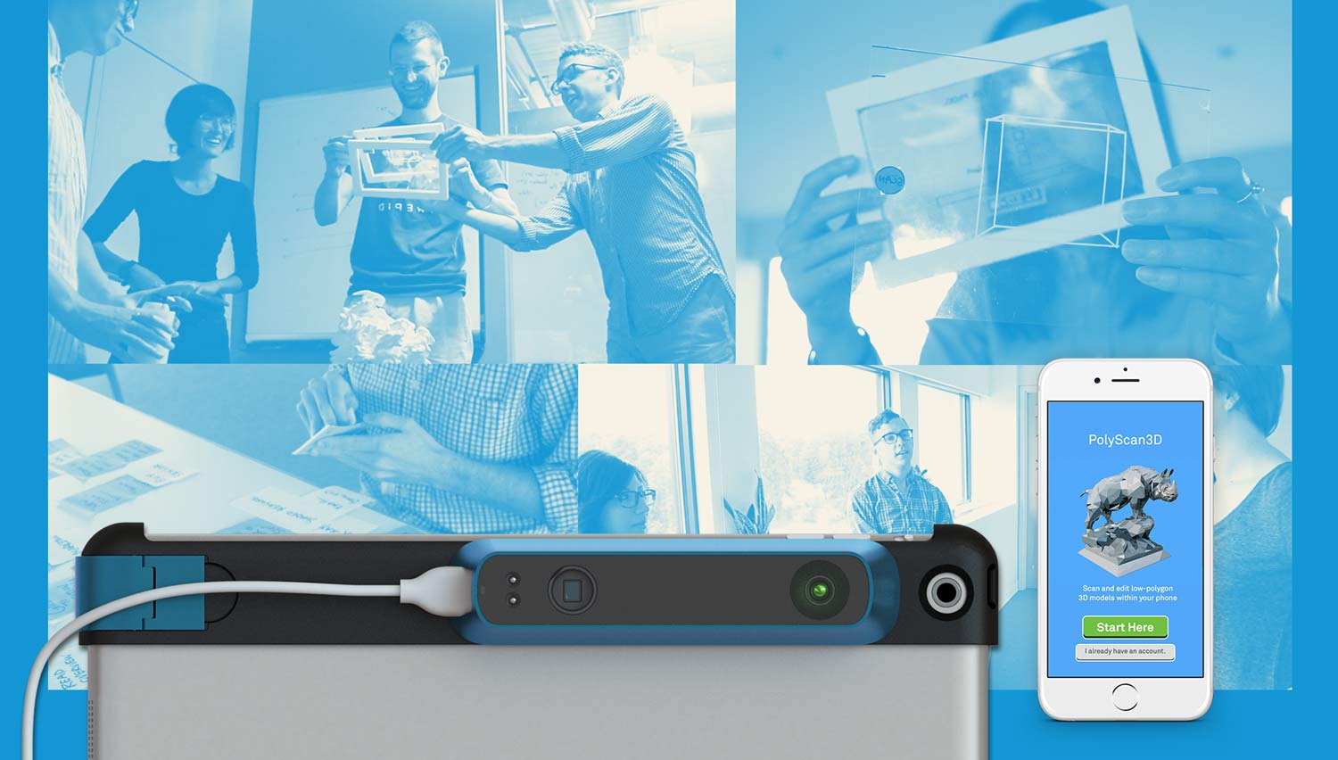
Occipital, a spatial computing company based in San Francisco, CA seeks to bring the physical world into a digital reality and reintroduce the virtual in the tangible world through computer vision.
Occipital first became known for RedLaser, a barcode scanning app — the first iteration of this pursuit of bringing the virtual and tangible worlds into each other.
They asked the Fresh Tilled Soil apprentices (Tricia, Luke, Islanda and I) to evaluate on how they're achieving this goal with their latest release — the Structure Sensor and its three complementary demo apps.
1. Identify the Problem
A. Heuristic Testing
We started this evaluation first by running heuristic tests on the demo apps. This type of evaluation looks at the application by its interface, without any user testing — and judges its compliance to usability qualities such as system status, error prevention & recovery, and consistency.
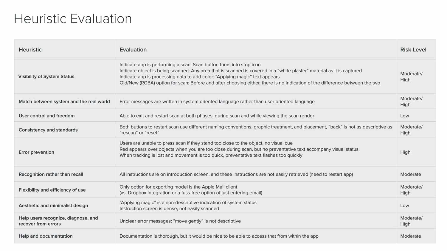
We found:
- A lack of visible real-time cues in the app to help users during scanning
- A lack of user-friendly language
- No on-boarding tutorial except for a paragraph
- Inconsistency in UI elements.
Basically... People would not know how it worked, why something's wrong, and would have difficulty enjoying their first time experience.
b. User Testing Findings
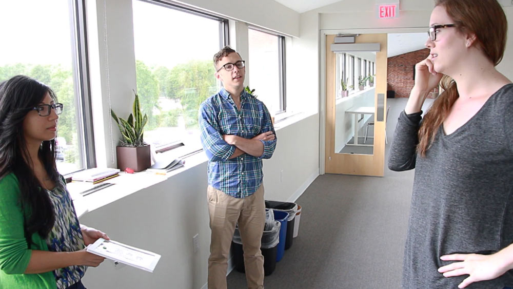
To further evaluate, we tested the app on real people and interviewed them about the experience. We looked for common pain points that would hurt their first time experience.
1. Almost everyone skipped or skimmed the text tutorial
The tutorial is entirely text and reads like a brick wall. Users just want to jump right in so they skip it but by skipping they were confused at how to use it properly. There was no way to go back to the tutorial except to restart the app.
2. The app feedback during the scan is confusing and unhelpful
The scan would often get displaced from users moving too fast, or it wouldn't register because users were standing too close or too far from the object they were scanning. Most resulted in less-than-satisfactory scans. This showed how the much the users' expectations differed from how the technology actually worked.
"Either I'm doing it very wrong or it just doesn't do it very well."
3. Users don't know for what purpose they would use the sensor.
After the scan, users' interest would drop once they realized that the scan was indeed a close representation of what they scanned. Besides viewing the 3D model or emailing themselves the file, there wasn't much they could do.
C. Our Hypothesis
We found that overall there was a lot of uncertainty and self-doubt. Most people just weren't sure if they were performing the scan correctly. They identified the lack of feedback during the scan as the main cause for their uncertainty, and wished that they would receive more helpful coaching.
Our assumption from this is that
usability issues, a difficult first-time experience and
a lack of long-term purpose for the scanner are the main barrier to entry and the product's continued use.
- Usability issues
- A difficult first-time experience
- Demo apps has no rewards for long-term use
By improving the interface we can increase user confidence and create a better first-time experience leading to long-term use.
2. Testing Our Hypothesis
D. IA Improvements
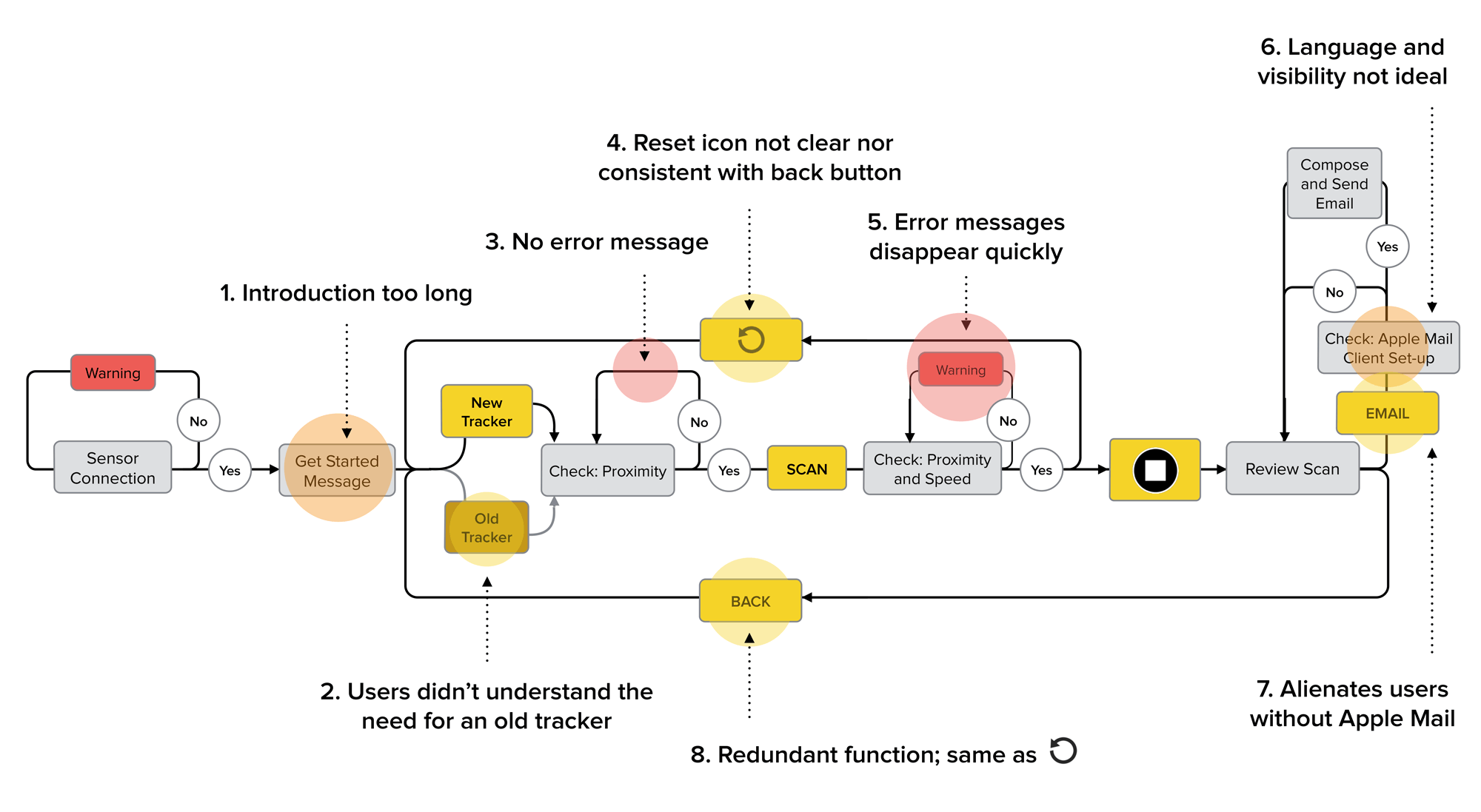
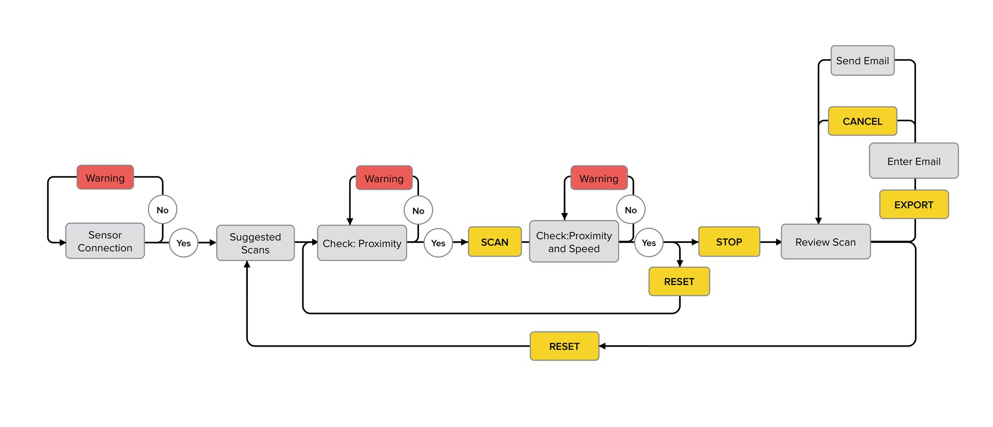
To test our hypothesis and proposed solution we first improved usability. We restructured the app's information architecture flow then we added helpful real-time feedback during scanning, and also increased the clarity and consistency of the UI elements.
Scanner App IA Before and After
E. UI Improvements
To test our improvements, we needed to create a prototype that would allow us to test our assumption on real users. But how do you test a 3D scanning app that's constantly reacting to a person's movements? The scan process features a live camera view and 3D mesh being mapped on the object in real-time. A digital prototype would be too complex.
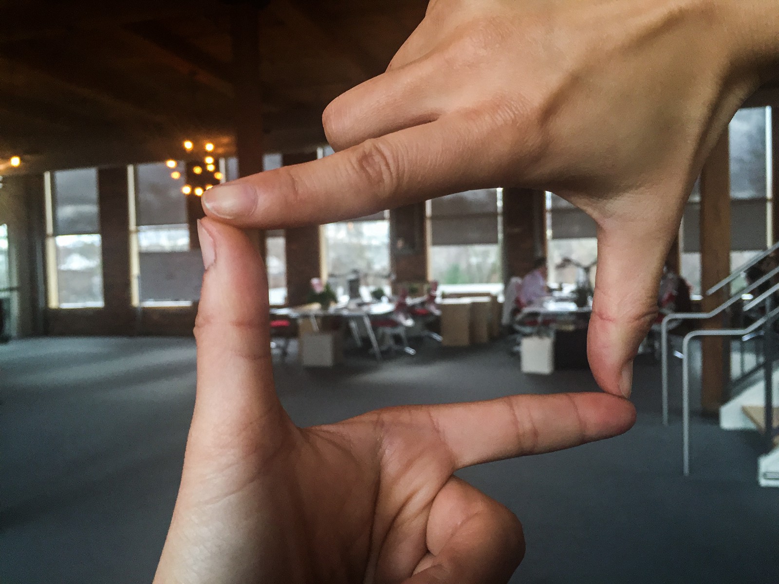
We found a low-fidelity solution by borrowing a technique artists have used for hundreds of years before the advent of the camera — composing the painting with your hands — except your hands are an empty iPad frame and the user interface is drawn on top of clear acetate. As for the showing live 3D data capturing, we ended up using shaving cream.
F. User Testing Our Prototype
When we tested the new and improved prototype with users, they found it to be a delightful upgrade. They felt the buttons were placed more appropriately, and alerts seemed more helpful.
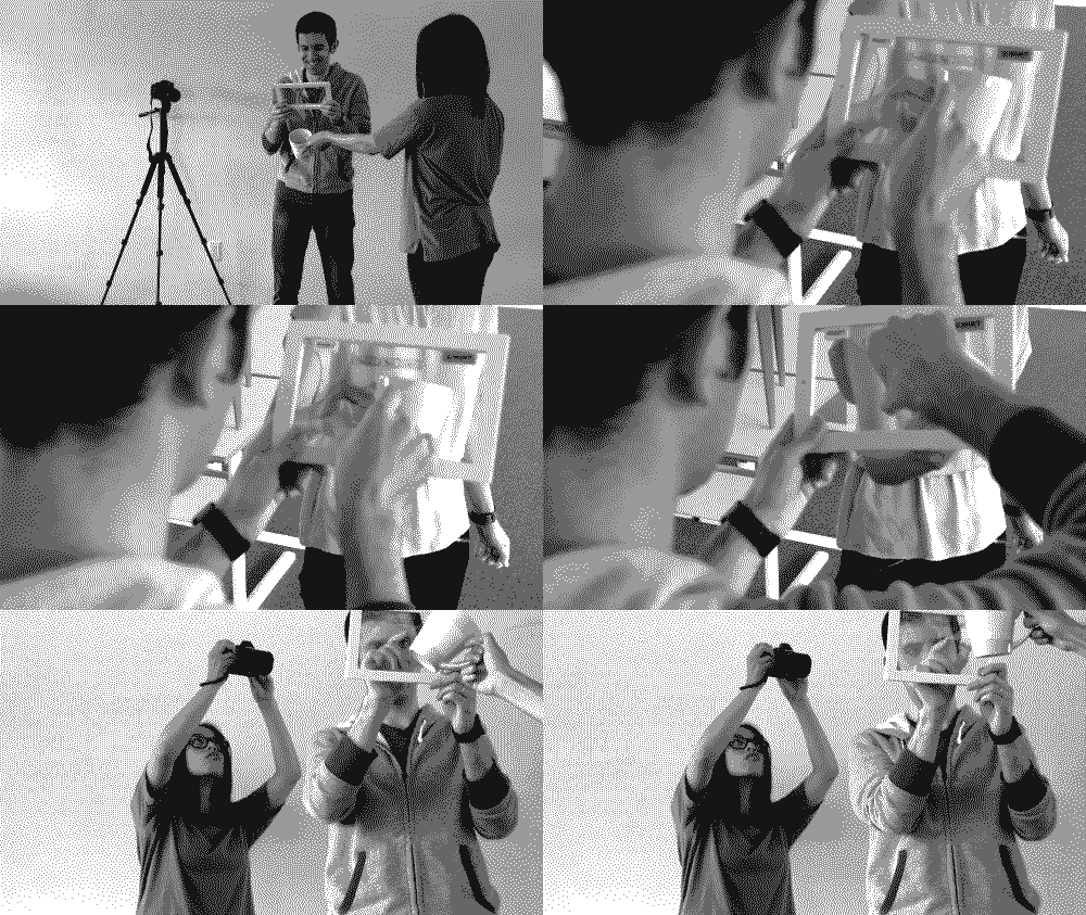
Generally users saw the improvements we made as positive, and said it made the experience better.
However, users still couldn't see a purpose to use it beyond the first few times. One user said:
3D apps have gotten a lot better... but I don't know why I would use them beyond taking 3D photos. "
Here is it. The crux of the problem.
Beyond the interface, beyond the usability, the core problem was in the goal of the app or rather, what goals are we helping our users to achieve? The current Scanner app, even when polished to the best version it can be and demonstrating the scanning functionality perfectly, still wouldn't be enough. For users to want to use the sensor as a tool and product they need it to solve their problem first.
The problem was that the apps didn't solve anyone's problem.
Even though Occipital developed these demo apps to demonstrate functionality and attract iOS developers for potential development — they are still consumers at heart and most would not spend the time, cost or effort on a new technology unless they also found a direct use for it in their lives or workflow.
The successful adoption of technology is also dependent on the availability of complementary products. In the game console sale wars the winner is usually the one with the best games, or third-party development.
From this point-of-view — it becomes less about what cool new features are available but rather how it matches with our user's lives and needs.
Our suggested next steps:
- Package the sensor with a more consumer-grade app help solve an everyday problem for a group of users.
- Move the sample apps off the front page let them shine in the SDK — to prevent them from misrepresenting the product.
- Disseminating more sensors to interested parties to get them playing around with the SDK — potentially through a rental/resident/influencer program. Note the power of word of mouth!
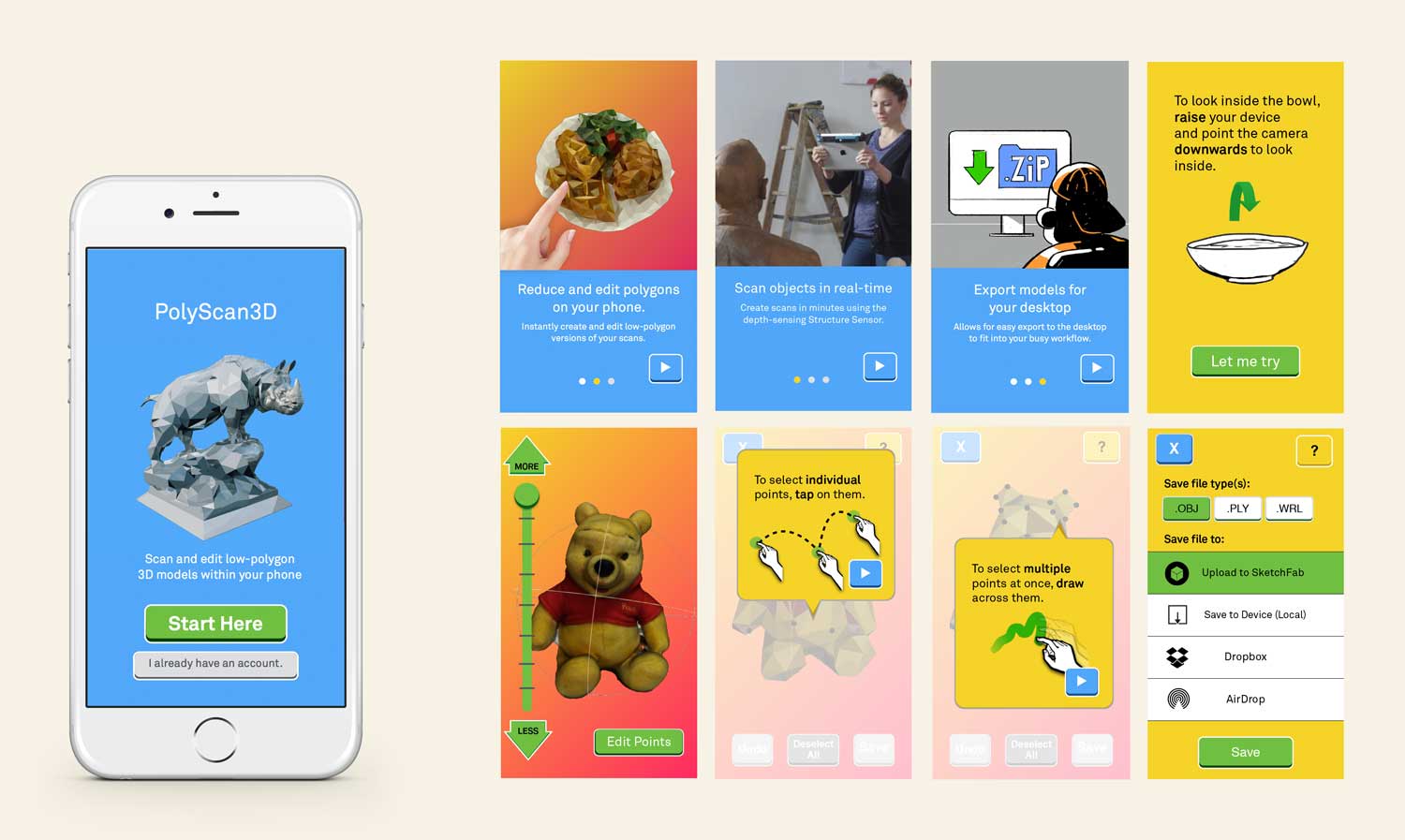
Occipital should focus on developing one polished and consumer-level app that serves an everyday need.
Redesigning the app for people who translate real-world object into 3D models all day
- Identify need
- Market Research Analysis
- Onboarding
3. Results and Key Insights
E. Result:
Through thorough heuristic and user interviews, IA improvements, prototyping and testing we found our initial diagnosis of usability problems surface wound.
F. Key Insights:
- Limitations of usability testing and information architecture improvement
- You will find a wealth of information from user testing (developers are still users!)
- Accurate insights can be extrapolated from a few user interviews (qualitative over quantitative)
- Idea generation within different industries